UX DESIGN
Goal: Outline a web application that would enable people in Northeast Ohio to find and share relevant local information and foster self-serve economic development.
BACKGROUND
In Spring of 2024, I compiled research from 32 interviews conducted with library and information science professionals, community organization representatives, and others to determine a preliminary direction for an information portal designed to connect citizens of Northeast Ohio to relevant local resources and regional knowledge. I created Personas & Design Requirements. From these requirements, I designed and tested a Taxonomy, which serves as a web application’s blueprint and outline of the content of a site. End users of a site would see pieces of a taxonomy in the site’s navigation: in the menu, and in the sitemap in the footer of a site, but would rarely see the entire taxonomy of a site all at once.
PROCESS
An initial Taxonomy was created based on all the types of content that would need to live in the web application. The primary function of the portal would be secure storage and sharing of vital documents, like Driver’s Licenses, Birth, Marriage, and Death Certificates, Social Security information, and other potential records.
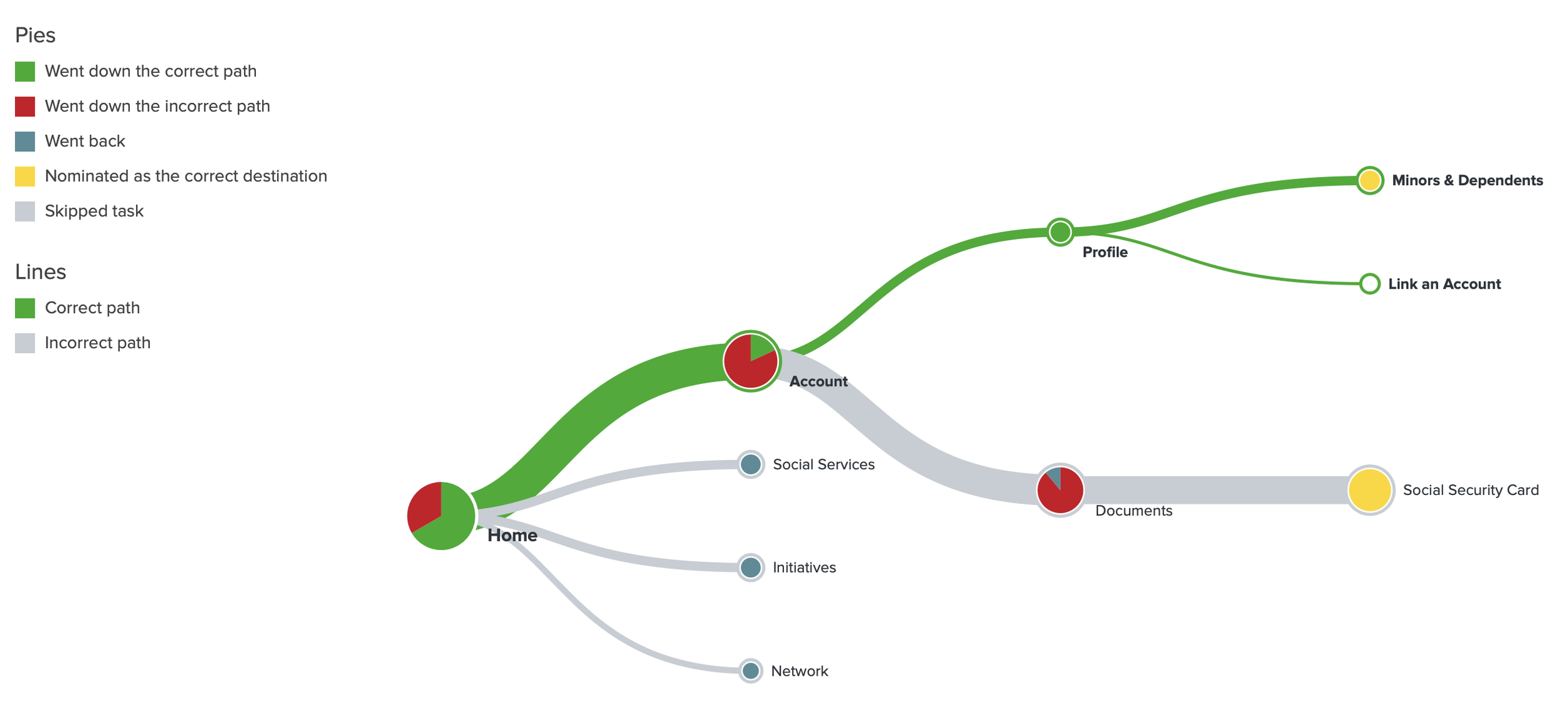
This taxonomy was tested using a method called Treejack Testing. The taxonomy was presented to 10 participants formatted like a basic site navigation menu, and participants are given a series of questions to see if they can navigate the taxonomy effectively.
The results of the test were analyzed and the taxonomy was refined based on the results.
Action: Created categories for the types of content that will live on the portal, tested the understandability of the navigation scheme with potential users, and refined the initial design an early definition of the Information Portal.
A successful path, an unsuccessful path, and a look at the directness score, which shows how many participants were able to find something on their first try, and how many were able to find something and realize they found it at all.
INSIGHTS
Many participants were not able to tell what this web application would be from the navigation alone. The clarity around messaging for a new concept like this portal will be critical to adoption.
A number of categories were renamed to be more clear to users (for example, “Network” became “Local Network,” and “Initiatives” became “Local Initiatives.” “Social Services” became “Helping Hand.”) Some of these names might be simplified over time as users became more familiar with the portal.
Paths were added to allow multiple ways into content, based on the primary paths participants took through the taxonomy.
The relationship between Children, Parents, Siblings, and Spouse Accounts for intuitive Document management will require ongoing testing.
Additional functions, like the Local Networking and Initiatives functions that seek to further civic engagement and economic development will also need many iterations of testing to become intuitive to new users.


