CX DESIGN
Enchanted Forest Children’s Program
for the Richfield Branch of the Akron-Summit County Public Library
Goal: Provide an immersive experience for young patrons by bring classic fables to life in an outdoor children’s program.
BACKGROUND
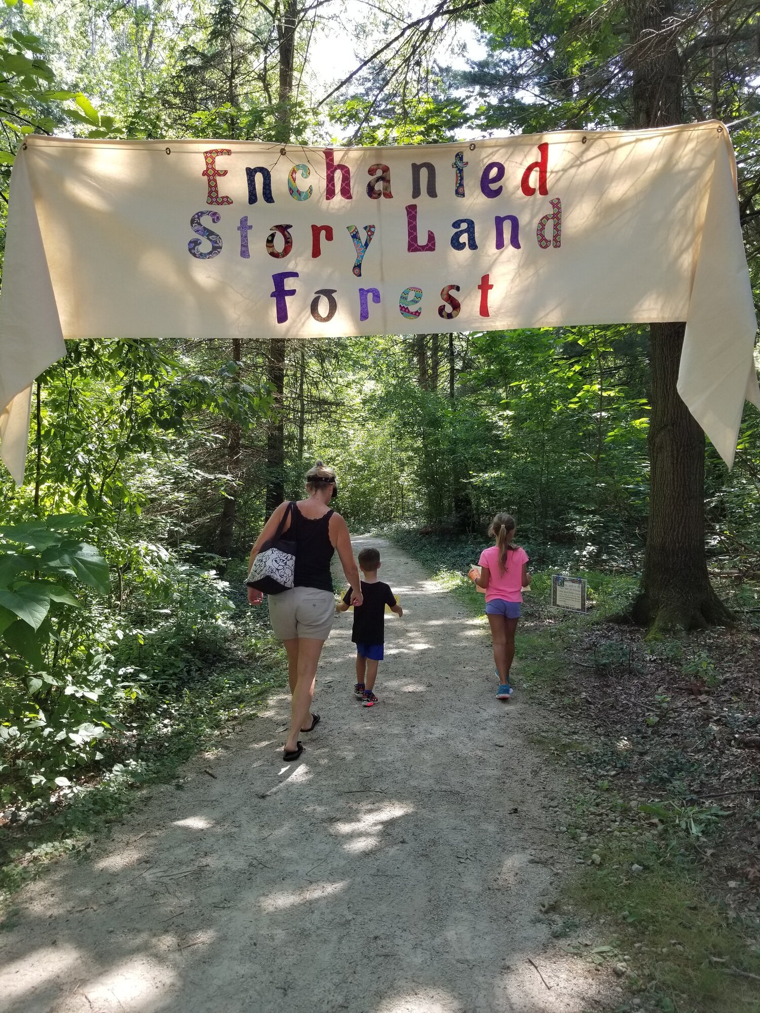
Richfield’s children’s librarian Diane was hiking on the one-mile trail next to the library’s property and thinking about how fairy tales, with all their strange and magical details, make so much more sense out in the woods. She decided she wanted to host a program on the trail, and brought me in to consult and design printed signage for the program.
What began as a program for 50 children grew each year into an event that draws between 400-600 people each year and requires extensive planning, logistics, and a small army of volunteers to produce.
PROCESS
Collaboration with the Diane to identify key themes of each featured story, the order in which the stories appear, and interactive elements between the stories (like “Stomp like a giant” after Jack and the Beanstalk, or “Catch that cookie!” after the Gingerbread Man.) I wrote and refined copy, designed the wayfinding elements by creating a clear information architecture around signs that further the narrative, and the interactions between them, and designed visuals based on illuminated manuscripts and historical illustrations.
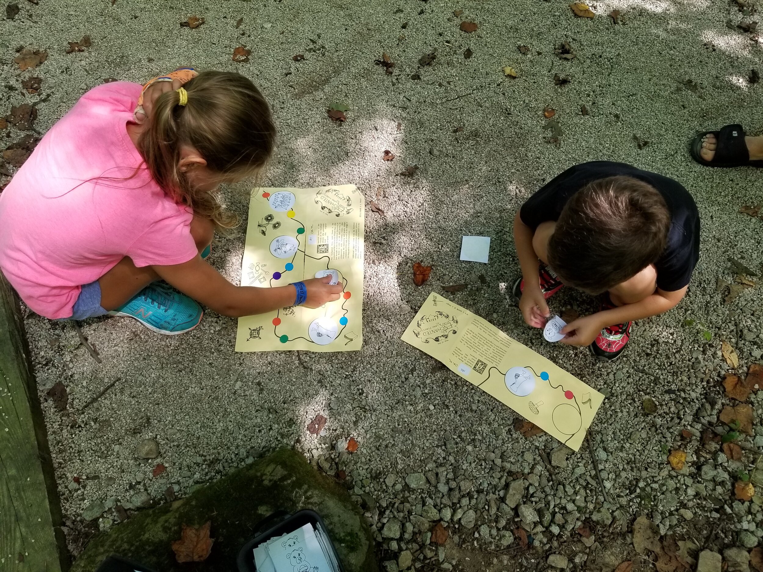
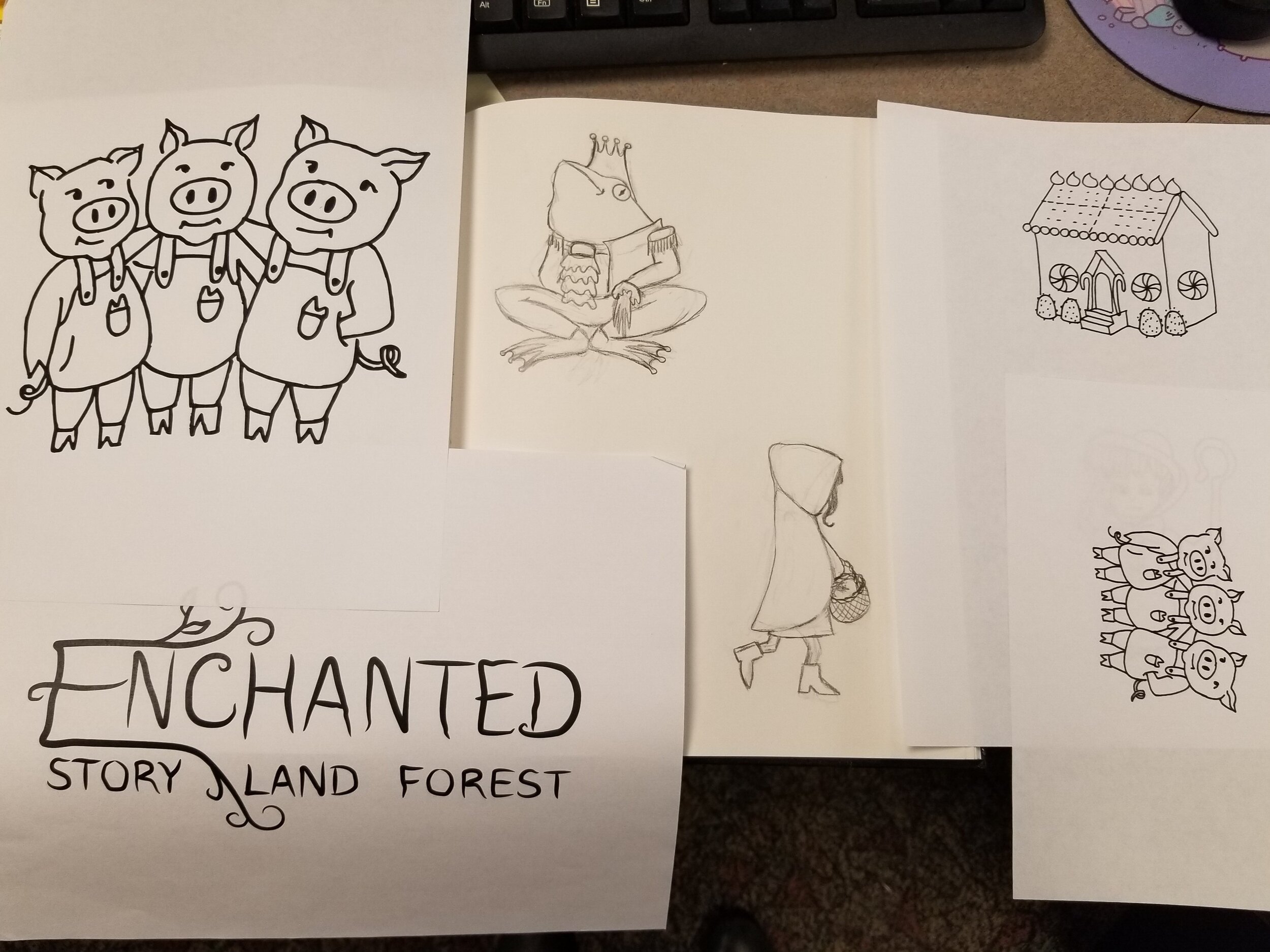
Iterations of the program each year led to additional design around parking, queueing, and timed tickets to accommodate the growing crowd. I designed a chapbook map that allowed young visitors to collect stickers instead of prizes at each of the ~12 stops around the trail, and I created original illustrations for not only the maps but for coloring sheets, t-shirts, and signage throughout the event.

Action:
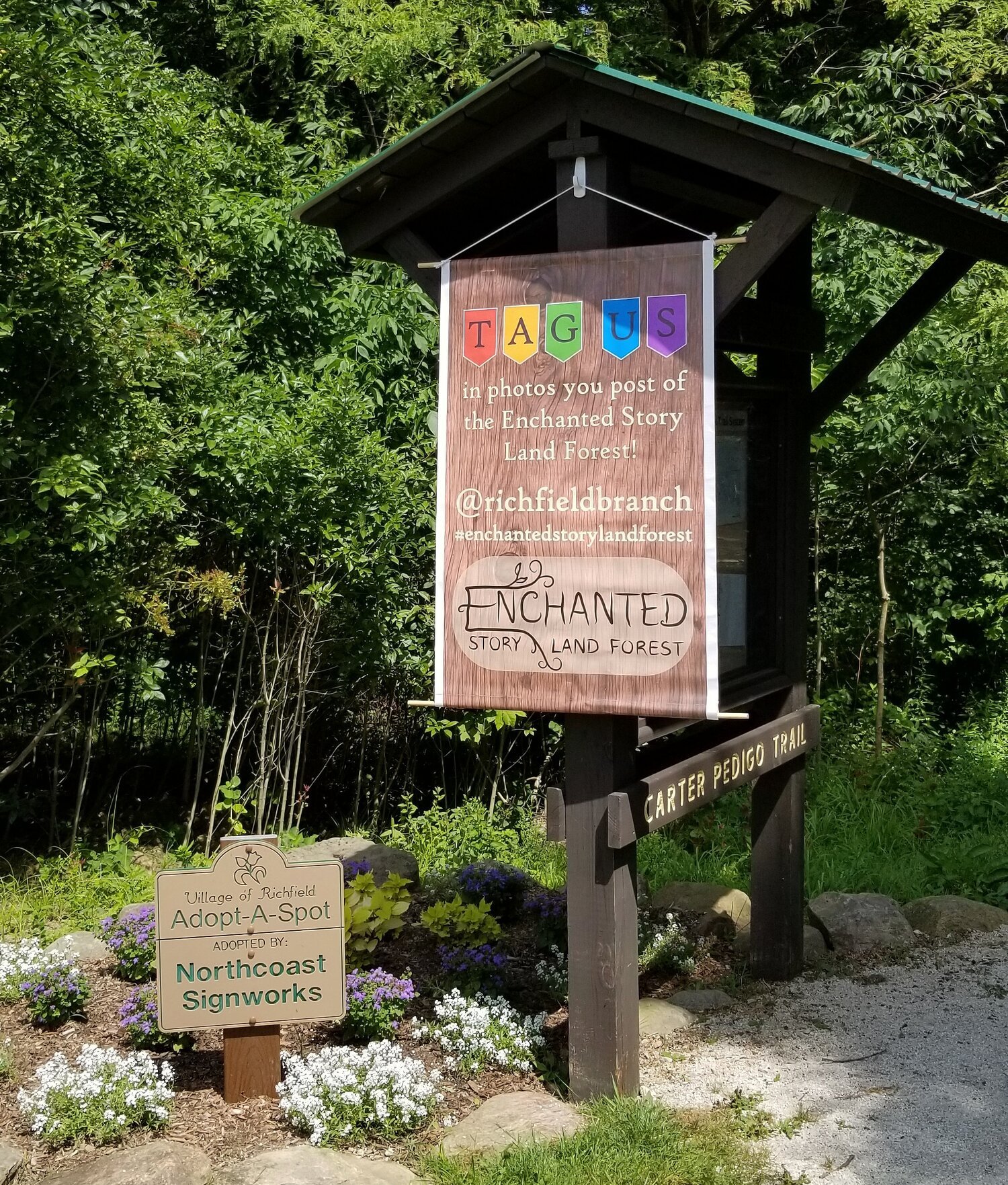
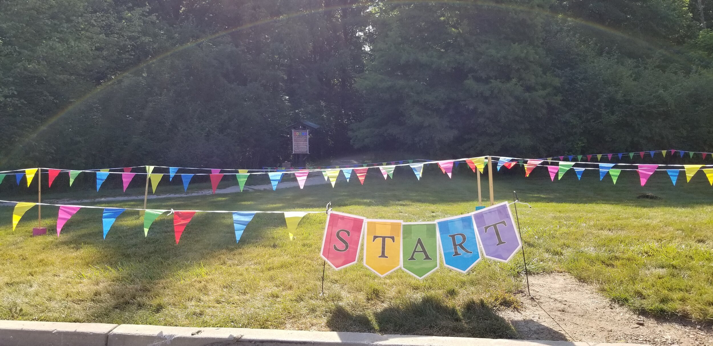
Designed wayfinding and signage throughout event, creating a clear visual hierarchy to structure the steps along the trail and the stations of the Faire
Map design and original illustrations
Design and production of promotional materials, banners, staff shirts, coloring sheets, stickers, scratch off cards, and other collateral
INSIGHTS
We learned going from 50 kids, to 150, to 600 by the third year of the program. Many elements needed rethought to preserve the intent of the program while letting it grow safely.
Each year I was able to observe patrons interacting with designed elements of the event and use that information to streamline steps, clarify directions, and optimize locations of signage.
The logistics of getting 12 sets of 150 trinkets out to each location along the trail meant we needed to redesign the event to allow more patrons to participate. This constraint inspired the design of the map for year three, which became a beloved component of the event. Kids collected stickers throughout the route, and collected a bag of prizes at the end or the trail.
Queueing became another design consideration, which led to the creation of the Faire. Local vendors set up stations around the exterior of the library, giving participants options for both before and after they went through the program on the trail, and stretching the line around the back of the building preventing traffic jams at the start of the trail and at the door of the building. Timed tickets and increased parking also helped manage how many people are at the event at one time.
